Many websites ignore the basic rules of interaction. Yet usability is at least as important as how a site looks.
If the world resembled a website, chances are that life would be pretty confusing.
Shops, for instance, would either be very long and narrow with hardly any staff, or tiny booths with enormous stock rooms - and hardly any staff. Others would look great but be impossible to get around.
Such is the experience of many net users, and the newness of the Internet starts to be a problem rather than a solution.
The dot.com boom was pitched as a revolution that would leave behind the tired practices of the old world and create something shiny and fresh instead.
But in the process it ditched some of the good things about the old world too, such as 50 years of research into the best way for people to interact with gadgets, be it a computer, mobile phone or slot machine.
The results of this research are not always obvious. It is quicker, for instance, to program a microwave to heat food for one minute 11 seconds than it is for one minute ten seconds.
Thinking about the reasons why can help designers streamline pages, devices and functions.
Ignorance of this work gives us the exciting gallery of websites that we have today, many of which are created with no higher aim in mind than to look good.
The fact that someone might actually want to use them, or download the pages in a reasonable amount of time, does not seem to have occurred to many creators.
"The design agencies that know HTML know nothing about human-computer interaction," says Catriona Campbell, founder and chief executive of The Usability Company, which helps companies work out if a site is good or bad.
The fact that webpage design packages let designers do almost anything they want is both a curse and a blessing, she says.
The fact that designers can do anything they want does not mean that they should.
"Regardless of what you think a site ought to look like, ask your users because they are the ones that have to deal with it," she says.
There are many gurus of website design, among them Vincent Flanders, who runs the webpagesthatsuck site. His particular bugbear is a font that is too small to read.
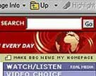
He is also heartily sick of sites that practise what he calls "mystery meat navigation" which use images on webpage buttons that give no clue as to where, or what, they lead to.
Struggle to understand
Previously, many website makers only did research on how easy - or difficult - a site was to use once it went live.
This created enormous problems for early users who had to teach themselves how to navigate around it, only to find later that it had changed.
"Once people have learned something badly they expect to do that again," Ms Campbell says.
These "learned effects" can make it hard to convince people to change their habits, even if the alternative is easier to use.
Many companies now use paper prototypes to find out what works best before they start building their sites, she says.
They also ask potential users to carry out card sorting exercises to see how they categorise and classify the subjects on a website.
Any site adopting this sorting system will find it gives users what they expect, rather than surprising and baffling them.
It is worth avoiding jargon; the functions of particular buttons should not change between pages; and give users an easy way to get back to the start.
Instructions should anticipate what people want to do and help them do it.
Every click that people make is effectively a decision and users will be reluctant to click if they either don't know where it will lead them, or they have been overwhelmed with information.
Thus as what was once revolutionary becomes mainstream, more and more websites will become easier to use.
This story can be found on the BBC website.
Return to newsletter
|