USEworthy December 2002
The monthly Newsletter from The Usability Company
Welcome to the December issue of USEworthy. This month Mark Ward from the BBC online chats to Catriona Campbell about 'Why Websites are getting easier to use.'
Paul Blunden discusses the poor usability of portals as one of the three reasons for 'B2C portal catastrophic failure scenarios.'
We take a look at one of the webs' leading retail sites www.allders.com to evaluate its' purchase process.
Finally Arlene Kline continues the accessibility four-part series by discussing the business issues surrounding the development of accessible products.
Company News
Victor Chandler win
The Usability Company has signed a contract with Victor Chandler the leading bookmaker to provide information architecture services and usability testing for its website development.
Joe Coughlin, Project Manager for Victor Chandler said, "The Usability Company offers a comprehensive set of services that will meet the requirements of our project throughout the development cycle. We are very happy with our choice and anticipate a successful ongoing relationship".
Catriona Campbell, CEO of The Usability Company said, "We are delighted to be working with Victor Chandler on this project. Building in usability from the outset adds significant value to the development cycle and will provide excellent ROI. Victor Chandler customers will benefit significantly from this approach."
Conferences
Paul Blunden spoke on the 14th November at 'The UK Gaming Revolution:
The Emergence Of The UK As A Leading Online Jurisdiction' Conference in Russell Square, London. Delegates learned the importance of usability testing and its' lifecycle.
Catriona Campbell can be heard speaking together with a representative from William Hill at the IBC Wireless Gambling and Lotteries conference: Implementing Successful Mobile Gaming Services And Maximising Revenue Potential
They will be discussing how William Hill's site was made as usable as possible for its audience by researching their typical users needs, desires and knowledge around online gambling.
28-29 January 2003, 76 Portland Place, London
For more information visit the ibc Telecoms and Media website.
Why Websites are getting easier to use
Many websites ignore the basic rules of interaction. Yet usability is at least as important as how a site looks.
If the world resembled a website, chances are that life would be pretty confusing.
Shops, for instance, would either be very long and narrow with hardly any staff, or tiny booths with enormous stock rooms - and hardly any staff. Others would look great but be impossible to get around.
Such is the experience of many net users, and the newness of the Internet starts to be a problem rather than a solution.
The dot.com boom was pitched as a revolution that would leave behind the tired practices of the old world and create something shiny and fresh instead.
But in the process it ditched some of the good things about the old world too, such as 50 years of research into the best way for people to interact with gadgets, be it a computer, mobile phone or slot machine.
The results of this research are not always obvious. It is quicker, for instance, to program a microwave to heat food for one minute 11 seconds than it is for one minute ten seconds.
Thinking about the reasons why can help designers streamline pages, devices and functions.
Ignorance of this work gives us the exciting gallery of websites that we have today, many of which are created with no higher aim in mind than to look good.
The fact that someone might actually want to use them, or download the pages in a reasonable amount of time, does not seem to have occurred to many creators.
"The design agencies that know HTML know nothing about human-computer interaction," says Catriona Campbell, founder and chief executive of The Usability Company, which helps companies work out if a site is good or bad.
The fact that webpage design packages let designers do almost anything they want is both a curse and a blessing, she says.
The fact that designers can do anything they want does not mean that they should.
"Regardless of what you think a site ought to look like, ask your users because they are the ones that have to deal with it," she says.
There are many gurus of website design, among them Vincent Flanders, who runs the webpagesthatsuck site. His particular bugbear is a font that is too small to read.
He is also heartily sick of sites that practise what he calls "mystery meat navigation" which use images on webpage buttons that give no clue as to where, or what, they lead to.
Struggle to understand
Previously, many website makers only did research on how easy - or difficult - a site was to use once it went live.
This created enormous problems for early users who had to teach themselves how to navigate around it, only to find later that it had changed.
"Once people have learned something badly they expect to do that again," Ms Campbell says.
These "learned effects" can make it hard to convince people to change their habits, even if the alternative is easier to use.
Many companies now use paper prototypes to find out what works best before they start building their sites, she says.
They also ask potential users to carry out card sorting exercises to see how they categorise and classify the subjects on a website.
Any site adopting this sorting system will find it gives users what they expect, rather than surprising and baffling them.
It is worth avoiding jargon; the functions of particular buttons should not change between pages; and give users an easy way to get back to the start.
Instructions should anticipate what people want to do and help them do it.
Every click that people make is effectively a decision and users will be reluctant to click if they either don't know where it will lead them, or they have been overwhelmed with information.
Thus as what was once revolutionary becomes mainstream, more and more websites will become easier to use.
This story can be found on the BBC website.
Portals, Shmortals
A recent report by Gartner (Six Degrees of Failure or Success in Portal Projects, 24th Sept 2002) identified poor usability as one of the three reasons for 'B2C portal catastrophic failure scenarios'. The other two reasons were that the system wouldn't accept transactions due to requirements failure or technological anomaly and incorrect information being displayed.
A requirements failure or technology anomaly suggests that the project was poorly scoped or that the scope changed. No doubt at the time the project manager was translating the requirements of the various stakeholders into a tangible set of deliverables and something got missed along the way. Although costly to the organisation and annoying to users many organisations would put this down to the complexities of running a large integration project and deal with it in subsequent development under change control. This assumes they survive the fall out.
Displaying incorrect information, such as prices the example given by Gartner creates financial loss and is essentially lack of attention to detail in the implementation. Disappointing yes, but both this and the previous reason for failure are mistakes. They are aspects of the project scope that were considered within the implementation and simply incorrectly executed.
So why poor usability? First let us consider what good or bad usability is. Good usability can be described as a situation where the interaction between user and interface achieve the goals of both the user and the provider. For example a user wants to find information quickly and the organisations wants to provide it quickly so that the user either comes back again or doesn't use an alternative channel. A simple goal, and perhaps that is where the problems begin.
When the portal project is being scoped and the implementation process defined it is unlikely that usability is considered overtly. The reason for this is that it is a soft and largely misunderstood discipline and one, which many believe is common sense. Many vendors explain that their applications have been subject to a level of user testing during development and clients are only too willing to believe that this is all they need to do. However, and almost by definition, portals are bespoke implementations where users will interact differently dependent on the content. As the content is unique between applications there is a strong argument for adopting a user centred design approach which is becoming popular in website development.
User centred design (UCD) is an end to end process that maps onto the development cycle and insures that usability is considered at every step. The big advantage of UCD is that it not only informs about the usability aspects but also it provides crucial data about the features and functionality. This helps to avoid over-development and wasted investment during the project.
Gartner categorise the most common type of failure for portal projects as 'Teflon' portals, due to their lack of stickiness. They go on to specify the main reasons for a lack of stickiness as lack of clear vision and mission for the portal, failure to understand the user requirements, lack of usability in the design, lack of commitment to the content, no attempt to track user behaviour and inadequate information architecture. All of these are contained within the UCD approach and whilst they don't guarantee a good project, if a specialist organisation is employed, that know what they are doing, the chances of failure are certainly minimised.
Luckily Gartner also explained that the shelf life of a portal project is about 6 to 9 months due to the pace of change in the technology, so at least organisations that got it wrong this time will have another chance to get it right... quite soon.
Introduction
This month we take a look at one of the webs' leading retail sites to evaluate its' purchase process.
Allders website homepage layout reflects their new 'Fusion' shopping concept. This new way of shopping has been created exclusively for Allders and presents zones, based on the way 'we live our lives today'. The main headings – content labels – present options such as 'Living', 'Giving' and 'Electrical'. All seem intuitive and are presented neatly in different coloured boxes, although the lighter shades could cause reading difficulties for some users.

The home page doesn't convey any messaging about what sets Allders apart from its competitors and in fact there was, at the time of writing, a promotion for Tesco club card points that drew attention. The lack of messaging is probably explained by the high focus on Christmas, which is too be expected at this festive time of year.
Objectives
Our review was based on finding and purchasing that seasonal favourite - a dressing gown for a man.
Findings
From the headings we selected 'Sleeping' as this seemed the most appropriate section for our purchase. However on clicking through we were presented with bedroom products (Bed linen, Beds, Duvets, Pillows) and not bedroom clothing.
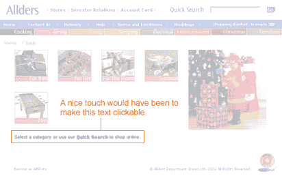
Our next selection was living where we found a wide range of homeware but alas no dressing gowns. Finally and probably we should have tried sooner, we looked at 'Giving'. Here we instantly found the category we were looking for and selected the 'For Him' option. Unfortunately here we were presented with two options or sub-categories, gadgets and grooming, neither of which was suitable. We were however advised to use the Quick Search facility and also note that this was available on the home page. A good aid to usability would have been to make the instructional text clickable, but the Quick Search box was clearly visible in any case.
Putting 'Dressing Gown' in the quick search facility provided a range (5) of options, each with a clear graphic and price. Instructional text was provided that invited us to click on the image for more details. We selected the Polar Fleece dressing gown and were taken to the next screen.
Allders site provides a breadcrumb that allows us to establish where we are in the site. At the dressing gown selection page we are in the 'Giving' zone.
The breadcrumb trail is very helpful but starts to raise questions about how intuitive the category labels are. Perhaps a further category titled 'Wearing' would be helpful? In any case the quick search facility was very helpful.
The selection screen we are then presented with is very good, easily understood and clearly labelled.

From this screen we can enlarge the image for a closer look, find out about washing instructions and the fabric content. There is a nice sales message too, albeit below the fold.
We select a grey dressing gown, size large by selecting '1' in the quantity drop down menu. The site provides two choices now, to continue shopping by 'add to basket' or to 'proceed to checkout'. As this is all we want we click 'proceed to checkout'.
We then find we needed to add the dressing gown to our shopping basket before proceeding to checkout and use the back button located by the breadcrumb trail to return. Unhelpfully the quantity field is now blank but as we are only interested in one item this is not a big problem. It would have been frustrating if we had selected multiple products.
We then select 'add to basket' and are presented with the following screen.
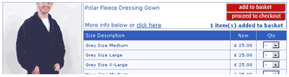
The quantity has been reduced to zero and the site tells us 1 item has been added to the basket. From a usability perspective users could miss this and we have seen it happen in the lab. Best practice would be to show the basket at this point so that users can confirm what they have added before proceeding.
When we do proceed to the checkout we are presented with a very clear shopping basket page, which provides the ability for us to check delivery, amend the quantity and have another look at our selected product. The links that are clickable are very clearly clickable, adopting the convention of underlined text.
The only criticism of this page is that the process bar has replaced the breadcrumb trail so that at first glance users may not be aware that there is a process indicator available. There would be usability benefits in presenting the process bar in a different way to the breadcrumb trail.
At the checkout screen a really usable feature is that you do not have to register to purchase, and in fact we have not been asked to register at any stage until now. We are asked at this stage but we are made aware of the benefits of registration with a simple sentence:

Sentence reads: You don't have to be registered to shop on allders.com, but if you are, enter your email and password here to help us to fill in your details automatically
If you want to register you are presented with the option further down the page and find that most of the work you have done in completing the checkout form goes toward the registration, with the user only needing to select a password.
As we complete the form all seems straightforward, however as with most forms on the web there are issues. In the address field we are presented with a delivery type box. The default is 'Special Delivery' and the alternative is 'select'. We have to assume that the delivery we are getting at £3 is special but this makes us look more than once. At the delivery screen we are provided with alternatives for delivery to billing address, which saves some legwork, or to an alternative address. Even a work address field is available!
Submitting at this point uncovers a usability issue. Although the form is apparently complete the second line of the address is missing. This is not highlighted clearly as a mandatory field as shown below:
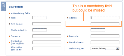
The error message that was presented however was very clear and instructive, and we feel that most users would be able to follow the instructions and correct any mistakes they may have made.
Error message reads: Either the following data was entered incorrectly or is missing: Please enter the second line of your customer address.
Finally we were presented with a clear and friendly confirmation screen and a reference number that was followed up almost instantly with email confirmation.
Summary
Although there are some usability issues the Allders website contains some nice usable features and a very clear and easily read style, once you get beyond the home page. It is unlikely that many customers would fail to purchase once in the process, although they may become frustrated at the early stages. We consider the key usability issues that could be improved are the category labels and the screen that follows – add to basket.
All we can do now is await the arrival of our new dressing gown!
Accessibility: Four Part Series
Part Two: Business Issues
There are 2 million people in the UK who are blind and partially sighted. (Royal National Institute For The Blind). In The United States there are estimated to be 6 million disabled people. Given the number of disabled users this is a largely untapped revenue source.
As technologies become pervasive and less expensive more people are able to gain access to the Internet and online shopping/transactions will become more important. Being able to do this from the comfort of their home environments is especially useful to the disabled users. Those companies with accessible websites will benefit from increased customer patronage.
Companies who provide for their disabled users will benefit from a more positive brand perception.
Disabilities tend to increase with age, for example, serious sight loss is an age-related disability with two-thirds of sight-impaired people being over 60. As these "Silver Surfers" (those around retirement age with time and disposable income) are one of the fastest growing user groups of the Internet it makes good business sense to provide facilities for them to transact online. Already 20% of people aged 50 and over use online shopping sites (Age Concern England, 2000).
"Accessibility is a competitive advantage," says Election.com CEO Joe Mohen. "It's an economic opportunity to broaden our mission and differentiate ourselves, and it's solid, logical business that improves the value of our service. It's a good thing to do from a Wall Street perspective."
According to Karen Solomon of Wired magazine the more conservative estimate states that there are up to 6 million disabled Internet users in the United States alone, according to statistics from the NUA Internet Surveys.
Obviously conforming to all 66 accessibility guidelines is a huge undertaking for any business, which is why the WAI have included priority ratings. That said the guidelines could still be ambiguous and difficult to interpret. Even then there is still the issue of making appropriate recommendation to rectify the problems. This is where expert advice is invaluable. The Usability Company works closely with the Royal National Institute of the Blind (RNIB) and are able to steer businesses through the RNIB's proprietary "See It Right" accessibility conformance program or indeed through gaining conformance to Bobby or WAI guideline.
Next Month, Part Three: Technical Issues
Click here to print
Back to The Usability Company website
|