|
Products can be accessed via the 'Directory' or 'The Collection' categories on the LHS, but either way the users can quickly select and purchase products. This is quite an efficient process and the details to fill-in are kept to a minimum, with no required registration to impede the process.
Nice provision of an enlarged section of the product helps users simulate a real life inspection of the product detail.
Usefully, a summary of the basket is constantly available on the LHS of the screen. It shows the details most users want to have readily available: the number of items and the current total price. There is also a link to the checkout/basket, to allow users to checkout or amend the basket quickly.
There is no indication of what section the users are currently in. This means they have to remember the section name as there are no "Previous" or "Next" navigation controls and the users must select the correct category to see the listing of items again. Highlighting the current category would indicate to the users where they are on the site and providing navigation controls would allow the users to move more freely around the shop.
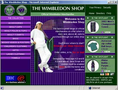
Shop home page
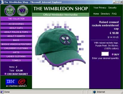
Product page showing lack of any navigational controls and no indication of what the current category is
Wimbledon - Usability in Action
|